First off, apologies for the lack of posts lately, i have no excuse as to why i have not been updating this blog over the last few weeks, but i am hoping to get a bit more time to update it more frequently over the next few weeks.
To kick things off i am just going to throw up a quick post. Last weekend i went away on a short trip to Edinburgh, Scotland. I have been there before, this time i was going over to help my friend with some luggage who is moving to Edinburgh.
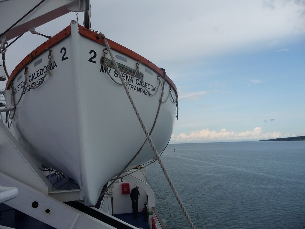
Instead of taking the plane as i would usually, this time it was the ferry. The reason is that since we had a few bags to carry over, they would be too heavy and cost too much to take on a plane, also tickets for a ferry are remarkably cheap compared to a flight. The main difference between the ferry and a plane is that the boat journey in total takes about 10 hours, that includes leaving from my house, driving to Belfast, taking the ferry over to Scotland and then taking a 4 hour bus trip to Edinburgh city as opposed to about a 40 minute flight.
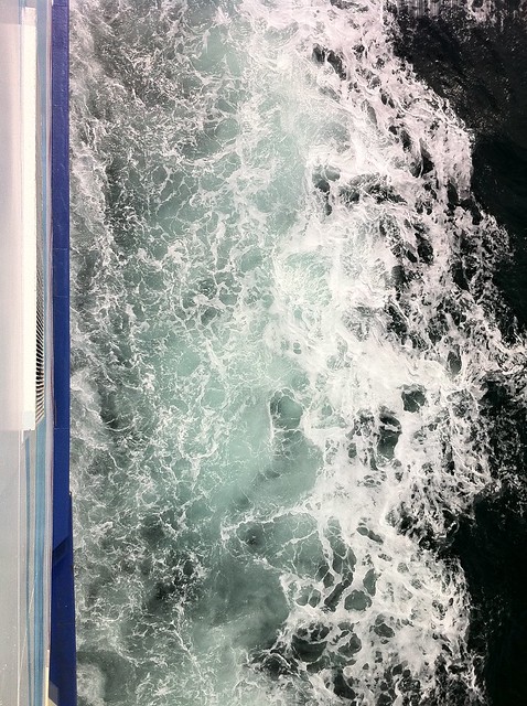
I was actually looking forward to taking the ferry, i think the last time i was on a ferry was when i was 8! Up until i was 8 i always travelled by boats, but then planes became the norm each year from then on. It was interesting being back on the boat, its great that you have the freedom of walking around and you have a lot more leg room, a lot more! The ferry takes 3 hours to cross the sea, during those 3 hours, me and my friends just had some breakfast, watched a film in the cinema (the film was Tron Legacy), and then just went out on deck and walked about.
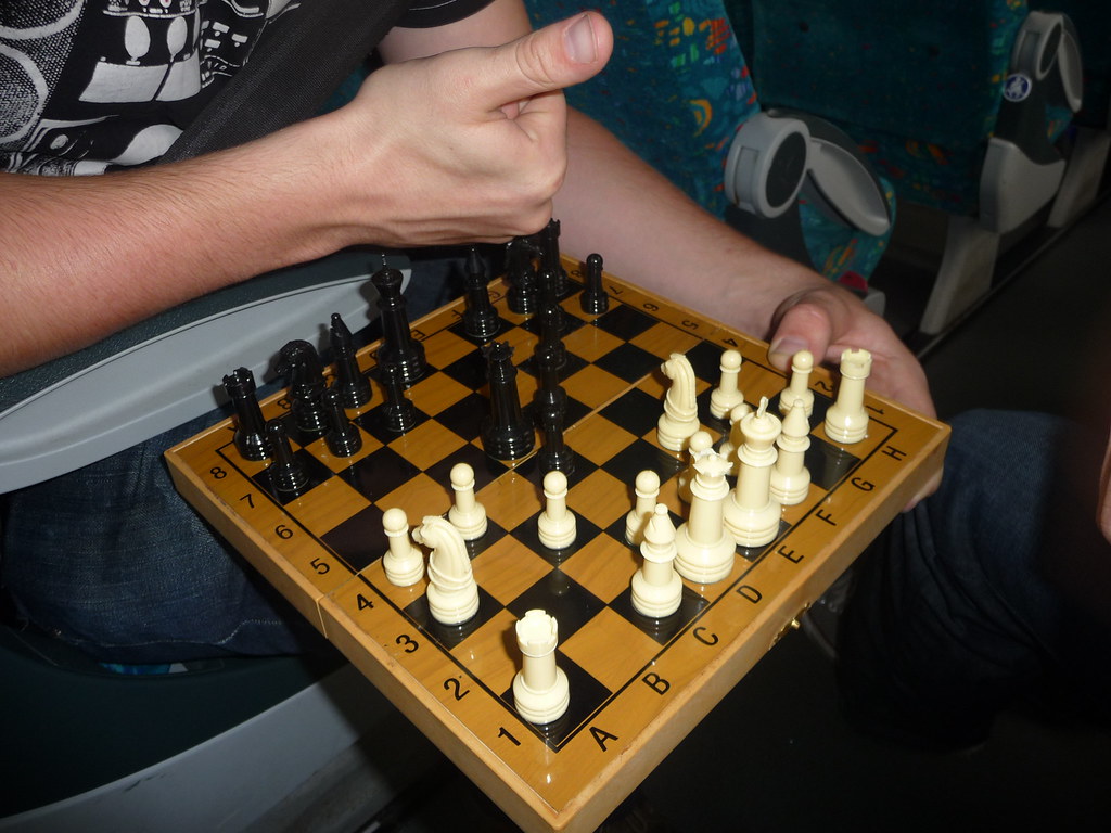
We arrived in Edinburgh city just after lunchtime on Sunday after having a pretty epic 1 and a half hour chess game on the bus. Originally we were due to come back the next day, Monday, but managed to get our tickets changed to Tuesday which gave us a bit more time to enjoy Edinburgh.
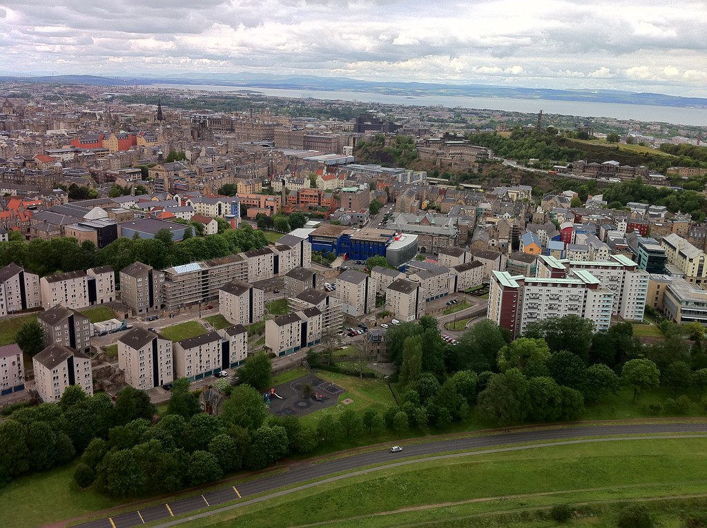
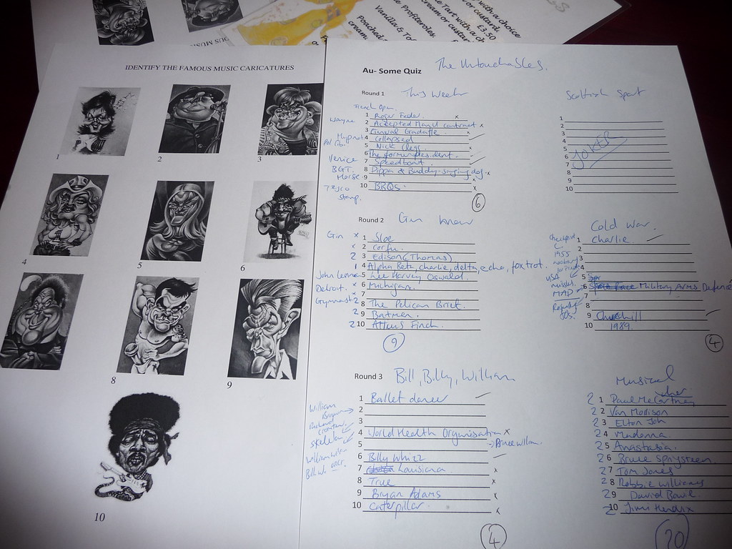
A few things we got up to included watching a film, going to a Tapas restaurant which had great food, entering a table quiz where the word appalling would probably be an understatement as to how we done 😀 but fun none the less and we also went up a sort of mountain, not sure what it was called but gave a great overview of the City. I hope to have a panoramic view up soon, i have lots of photos i took which i hope i can turn into a panoramic view.
The trip home was not as bad as going over i think, the reason was that i had only 1 hour of sleep before going over and on the way back i had a proper sleep so i was not tired in any way once i got home. I really enjoyed the trip and look forward to the next time i head over.
Here a some pics of the trip and once i get the panoramic done i might have a few more to throw up!